Reporting Dashboards
By creating a unified, visual, and filterable dashboard system, I helped clients transition from fragmented reporting to one coherent interface, boosting adoption, cutting confusion, and setting up a scalable reporting foundation.
ROLE
Lead product designer
TEAM
Product manager
Frontend developers and data engineers
Senior leadership team
TOOLS
Figma • Contentsquare • Superset
SKILLS
End-to-end product design
Discovery • Research • Interviews
Usability testing • Prototypes
Design process
THE PROBLEM
Universe’s dashboards were extremely limited in their data scope.
Their performance and accuracy were even worse.
Data was all over the place.
We were losing clients to competitors.
Their performance and accuracy were even worse.
Data was all over the place.
We were losing clients to competitors.
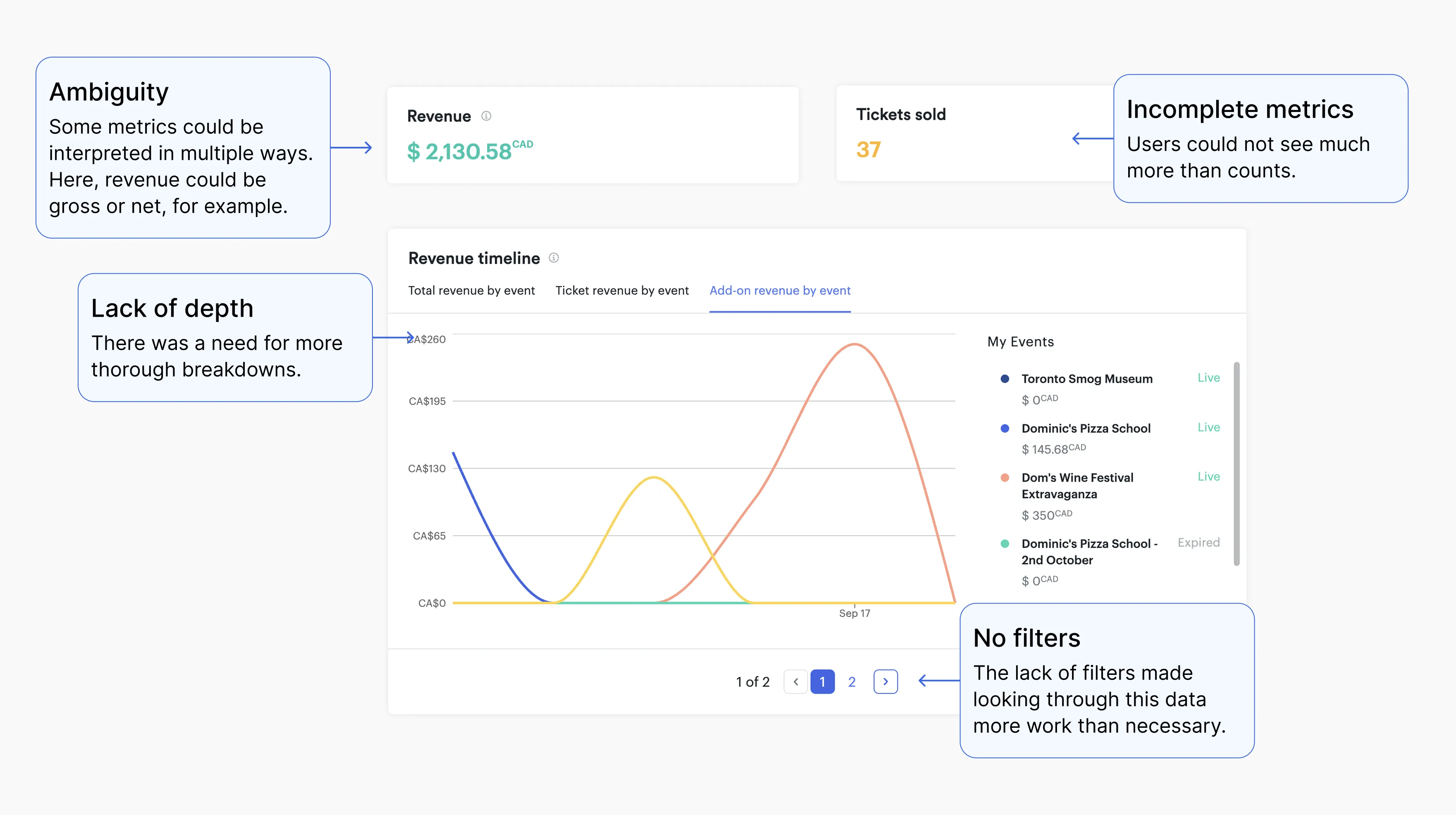
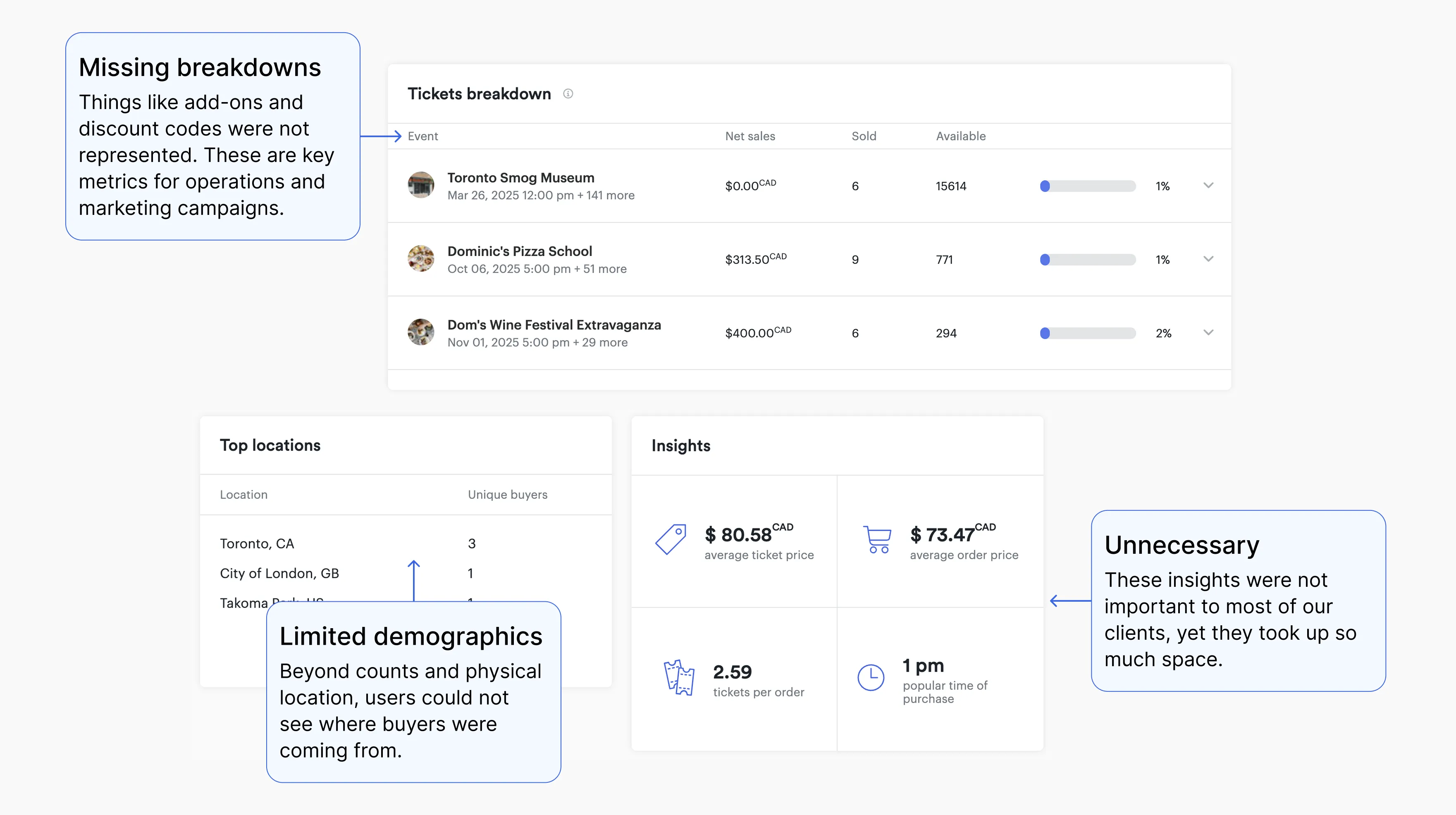
Clients had to navigate multiple dashboards, each with inconsistent metrics, limited filtering, and dated visualizations. This led to frequent support requests (“Which dashboard do I use?”), client frustration, and under-utilized data assets.
Why this mattered

1
Clients were paying to be part of universe, but could not fully leverage data to optimize revenue, marketing, or operations.
2
The internal team (support, CS, product) was overburdened explaining where data “lives” and finding workarounds.
3
As Universe scaled, the inconsistency in reporting threatened data integrity and customer retention.
Where I come in

Unlock more data
I led interviews with internal teams and clients to understand what they cared about most.

Complex → simple
Find a way to organize many more metrics than Universe has ever shown before, and make it intuitive to navigate.
Design strategy
We would leverage external software with its own design language. I had to ensure it matched our brand.
The first thing I had to do was research the problem. What did we know so far? How long have we known it? Why is it still a problem? I set out to answer all of these - and more - questions.
Research & Discovery
PERSONAS
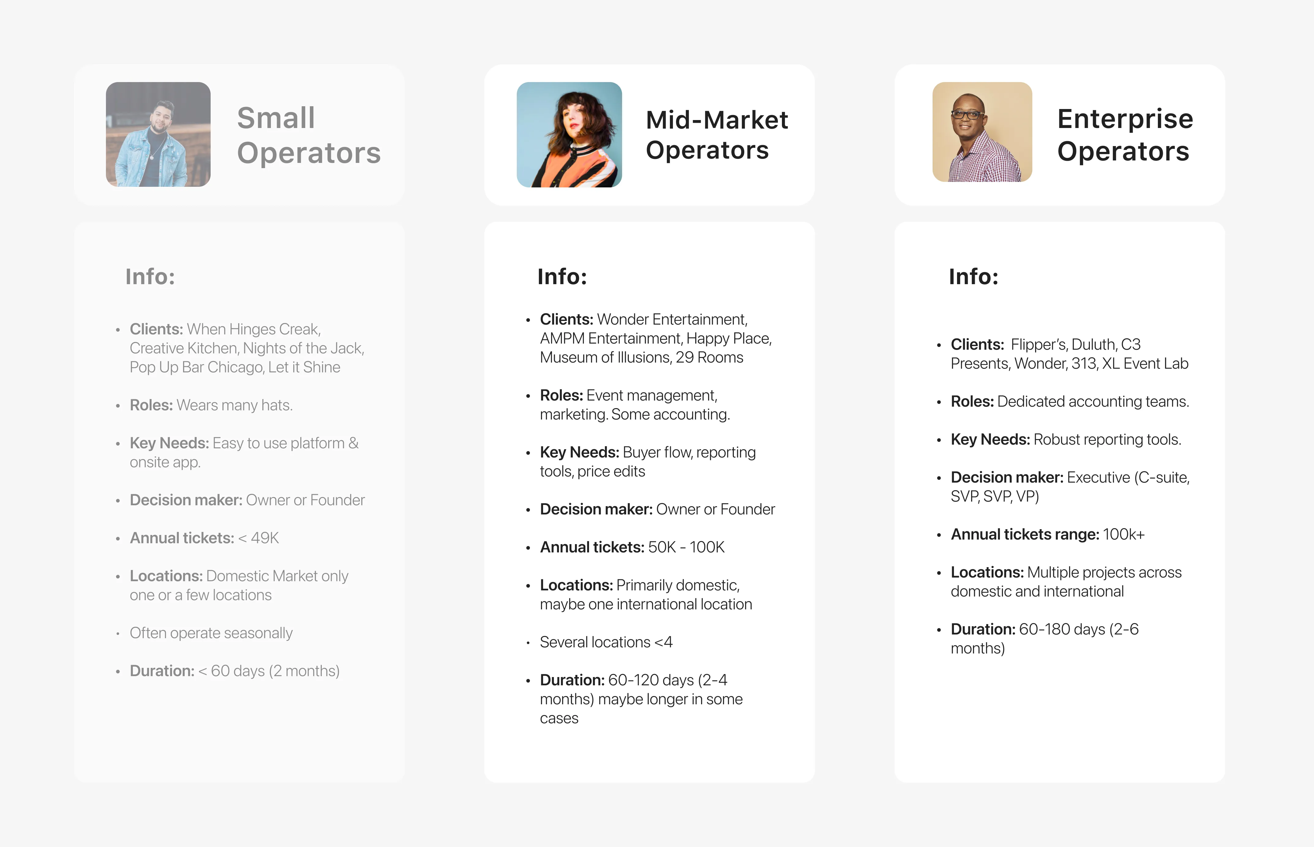
The first part of any problem is understand who has it.
I worked with my PM and leadership stakeholders to identify the level of clients most at-risk for leaving Universe due to our reporting. Our mid to enterprise-level event organizers were that group, and the people responsible for reporting wear many hats.
I worked with my PM and leadership stakeholders to identify the level of clients most at-risk for leaving Universe due to our reporting. Our mid to enterprise-level event organizers were that group, and the people responsible for reporting wear many hats.
CSD Matrix
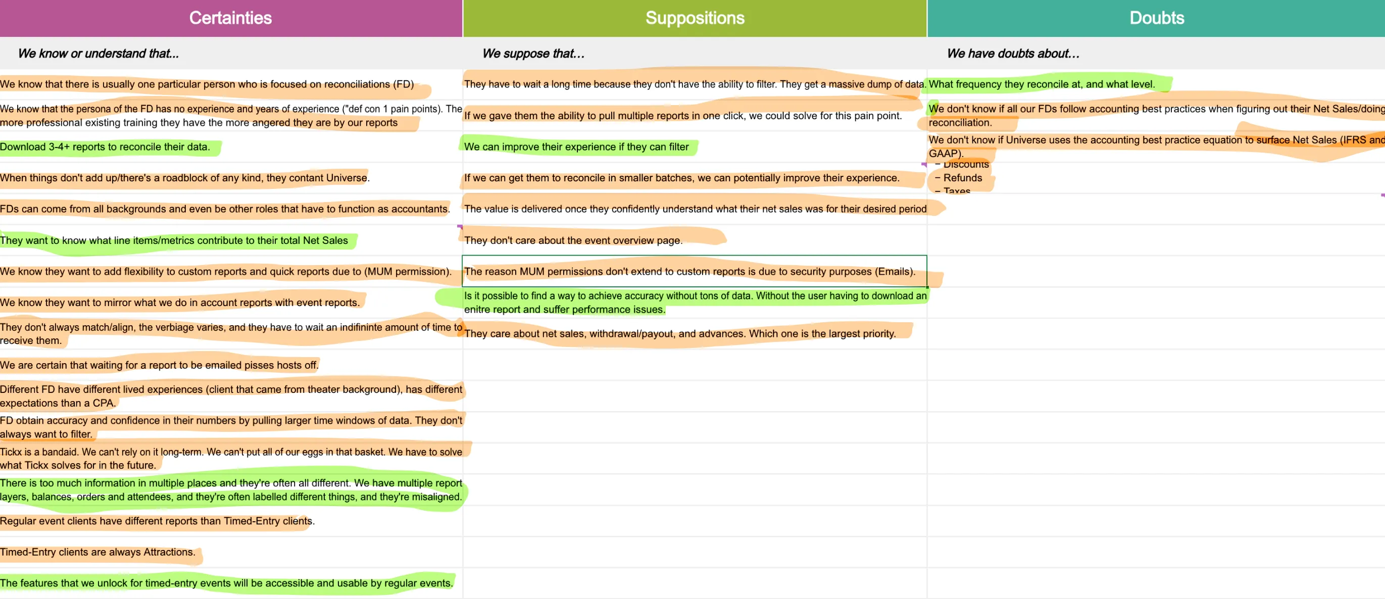
A Certainties, Suppositions and Doubts Matrix helped me structure next steps.
I would log everything we knew about our clients and their problems, everything we wanted to validate, and things we didn't know.
Any suppositions and doubts were turned into interview questions and hypotheses. Certainties could be scoped and iterated sooner.
I would log everything we knew about our clients and their problems, everything we wanted to validate, and things we didn't know.
Any suppositions and doubts were turned into interview questions and hypotheses. Certainties could be scoped and iterated sooner.
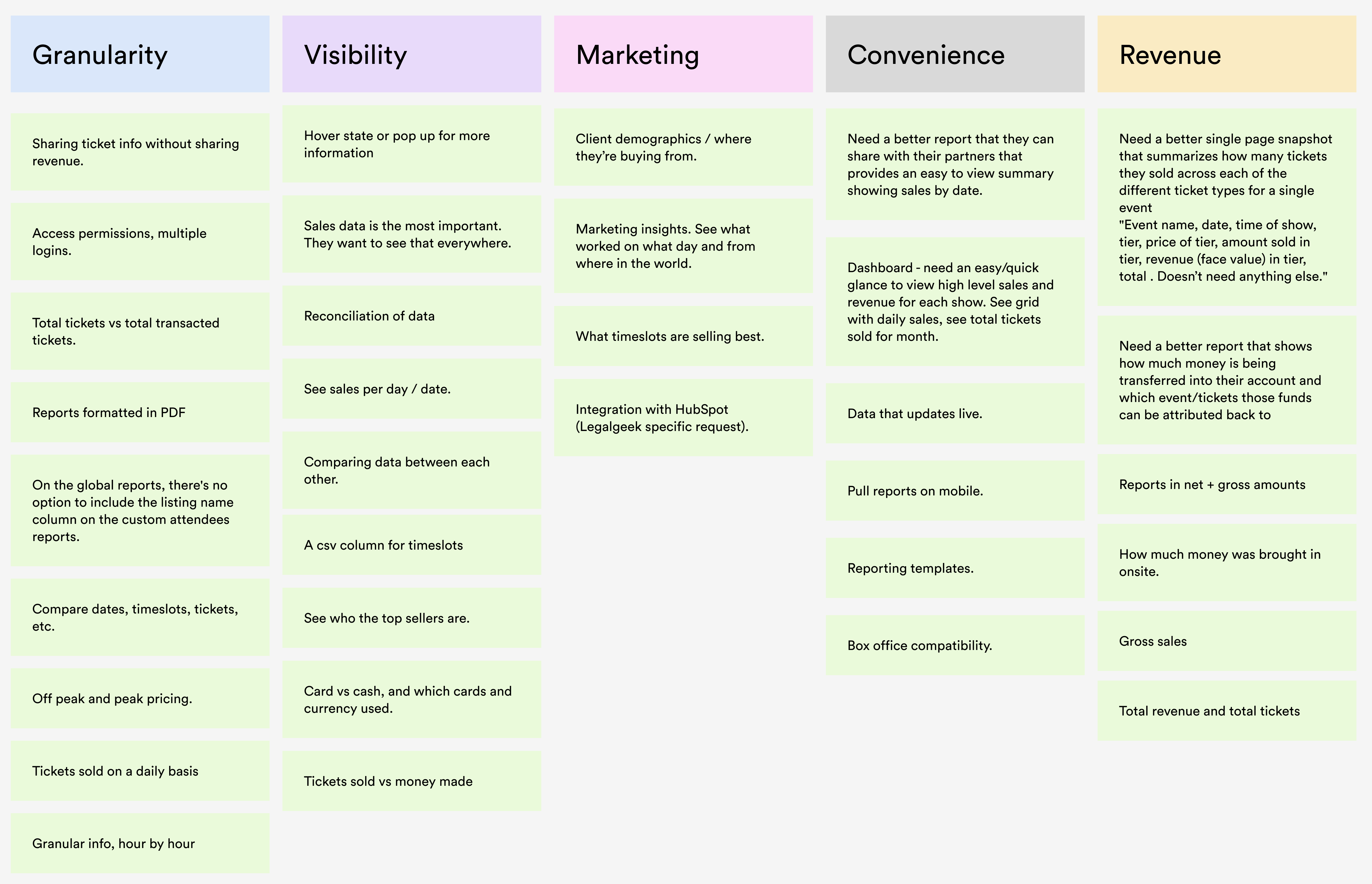
INTERVIEW INSIGHTS
Suppositions and doubts became our questions.
We validated out that users wanted granular filters, ability to group by time or ticket type, actionable insights, less tables, faster performance, real-time data, and one place to see it all.
They also wanted faster performance, timeslot data, real-time updates, and more.
We validated out that users wanted granular filters, ability to group by time or ticket type, actionable insights, less tables, faster performance, real-time data, and one place to see it all.
They also wanted faster performance, timeslot data, real-time updates, and more.
COMPETITOR RESEARCH
We also needed to see how our competitors had evolved in this space.
I audited all of our competitors at the time to see how they presented data on their dashboards, and to what depth. I also spoke with our portfolio companies to see what challenges they still face today, so we may avoid them.
I audited all of our competitors at the time to see how they presented data on their dashboards, and to what depth. I also spoke with our portfolio companies to see what challenges they still face today, so we may avoid them.
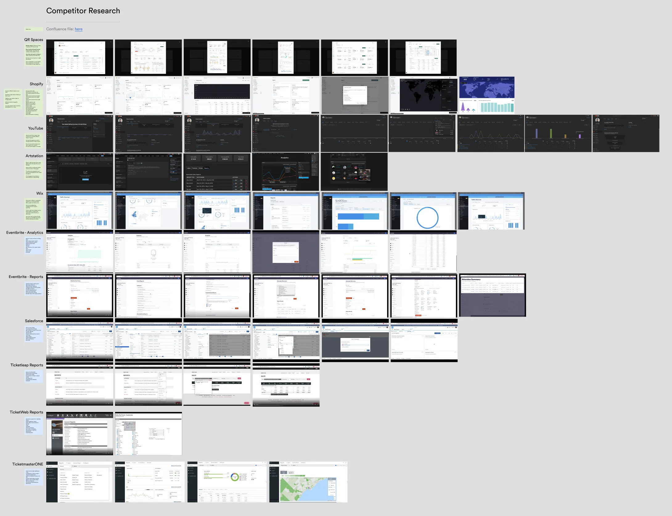
1
Competitors like Eventbrite, Ticketpass, and Fareharbor allowed clients to customize their data however they wanted.
2
The ability to filter dates, weeks, months and years was ubiquitous. Demographic data was common as well.
3
Being able to choose which metrics you wanted to compare was also common.
4
All competitors offered the ability to view their data in graphs or in tables, allowing clients to export their data how they want.
We knew it wouldn’t be possible to go from bare-bones to full-suite in one project. Technical constraints would make sure of that. And that would not be the only challenge we would face.
Challenges and Constraints

Prioritize features
We couldn’t do it all in one 6 month project. We had to prioritize.

Little budget
We didn’t have the budget to rebuild our backend data structure. We’d need leverage.

Time limit
Two clients left Universe as we worked on this project. We had to act fast.
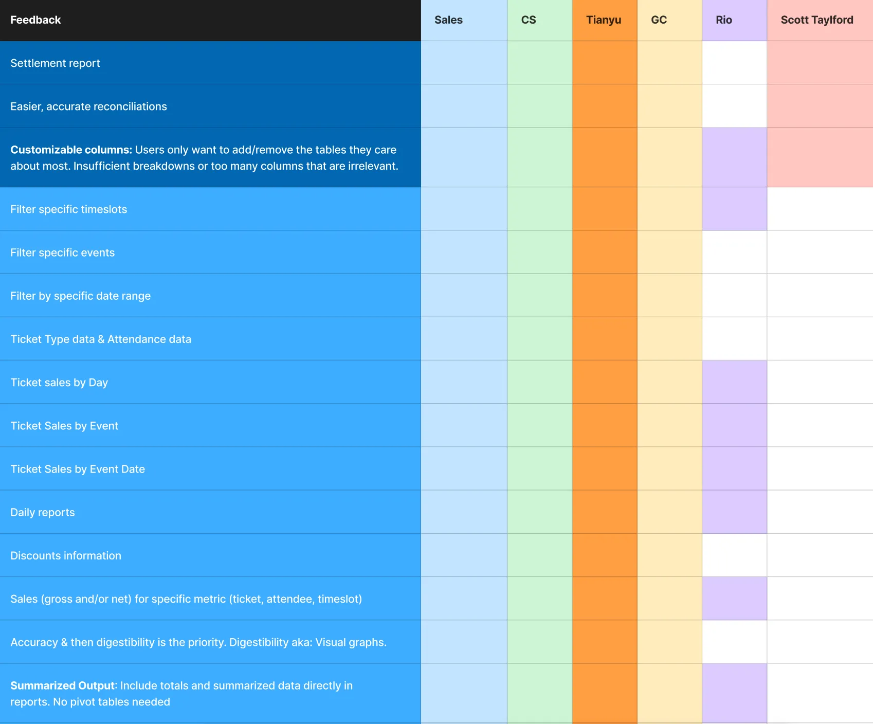
We would need an air-tight strategy to get us through these hurdles. To give us more clarity, my PM and I organized insights into a stakeholder matrix.
Stakeholder Matrix
We attached insights to the stakeholders that mentioned it in their interviews, that way we could see what asks were most dire. more an issue showed up, the more likely it would be prioritized. We could uncover our must haves from this list.
HYPOTHESIS
If we provide clients with a unified, visually-rich reporting dashboard that surfaces key metrics, allows flexible filtering, consolidates fragmented views, and enables accurate reconciliations, we could get around 20% adoption over legacy dashboards as clients face less roadblocks.
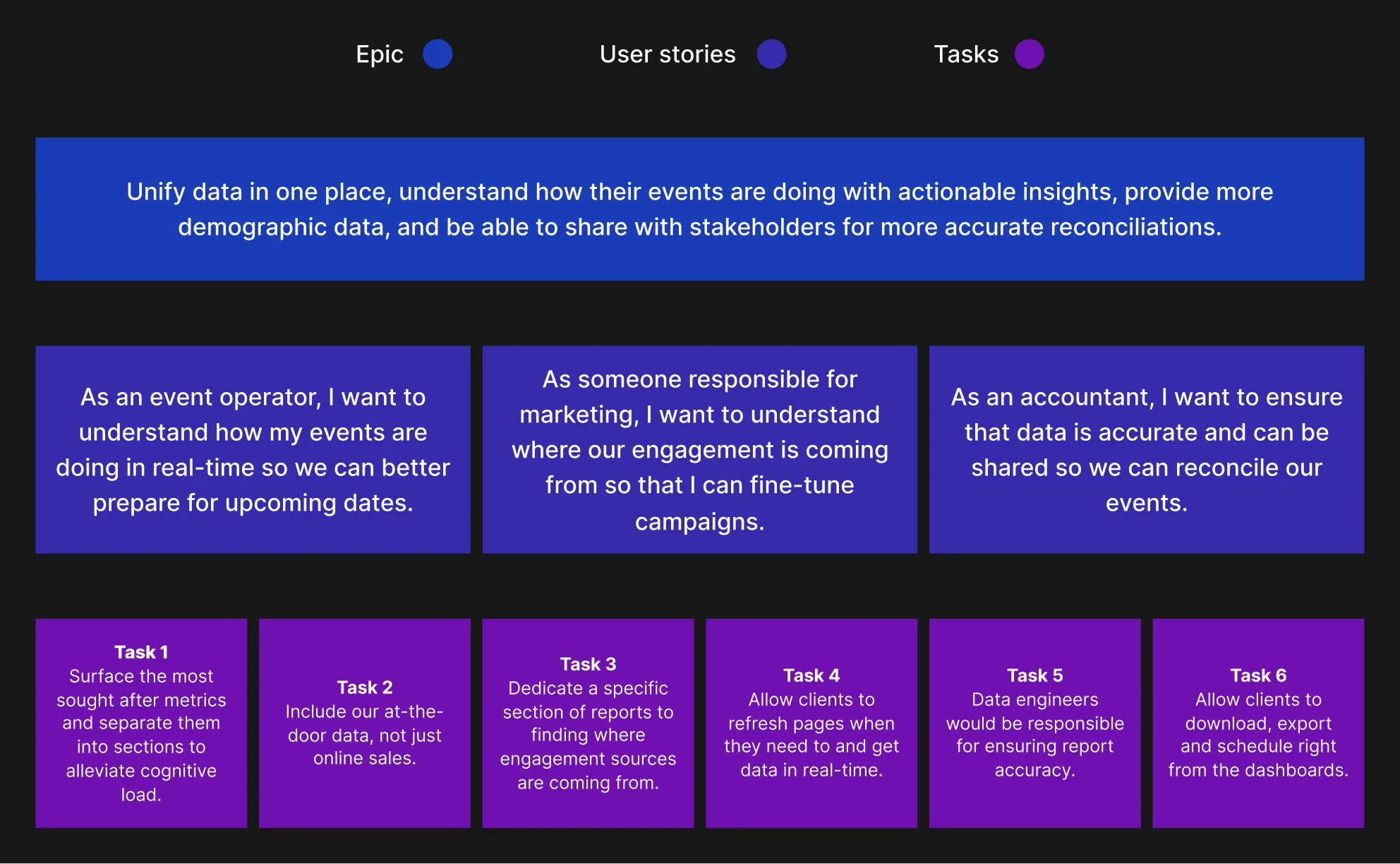
USER STORIES
Based on our interviews with clients and internal teams, and supported by our CSD and stakeholder matrixes, we identified our top priority flows for the first iteration of reports. We validated with our Engineering team that we could accomplish these goals within our first project milestone.
Contentsquare
To help with task flows, we referenced user journey data from Contentsquare. From this powerful platform, we could see all of the touchpoints our clients went through to achieve their reporting goals.
TASK FLOWS
We created a number of task flows to help us map the potential path our clients would take through our solution. This would help me ideate design solutions.
I chose to highlight the simples one as an example.
I chose to highlight the simples one as an example.
APACHE SUPERSET
Superset is an open-source data integration and visualization platform. The business would use it to take our data and visualize it, saving us time and effort. The problem is that Superset is fairly rigid when it comes to visual customization. I had to figure out how to balance between Superset’s designs and our own system. With this in mind, I set about understanding what the different charts look like in Superset by visiting the Superset visualization gallery.

DESIGN SYSTEM
I leveraged our existing design system to find components that best matched the ones in Superset. I also had the opportunity to contribute new ones with the help of our development team. Find out more about my history with our design system by clicking the image below.

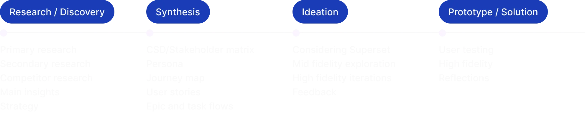
Iteration Process
MID FIDELITY
By creating digital mid-fidelity designs, I could get feedback directly in Figma rather than going through a longer process with sketches. This is a choice I made as Universe is a remote-first workplace.

Version 1
With this version, I wanted to validate the metrics we were looking to surface, as well as the charts that could accompany them.
Version 2
The goal here was to match the charts in the visualization gallery to our design system.
The main piece of feedback was hiding the dashboard filters inside a tiny icon on the top left, like Superset does.
Engineering also confirmed we could build new filters, unlocking a great level of freedom in this regard.
The main piece of feedback was hiding the dashboard filters inside a tiny icon on the top left, like Superset does.
Engineering also confirmed we could build new filters, unlocking a great level of freedom in this regard.
Version 3 and beyond
The focus was on perfecting the filters, completing the metric visualizations for the other tabs, surfacing more of the metrics our clients needed, and refining user flows.
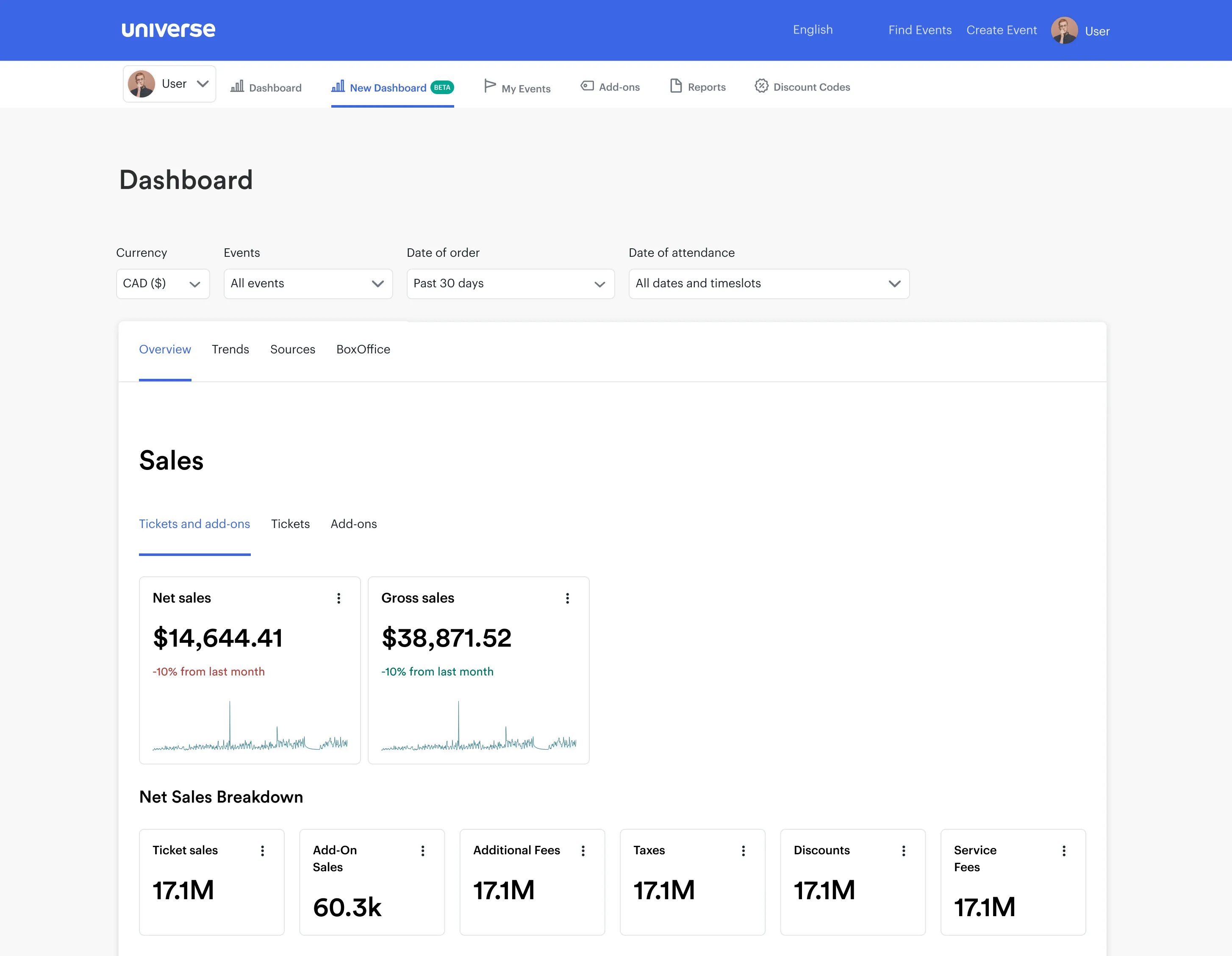
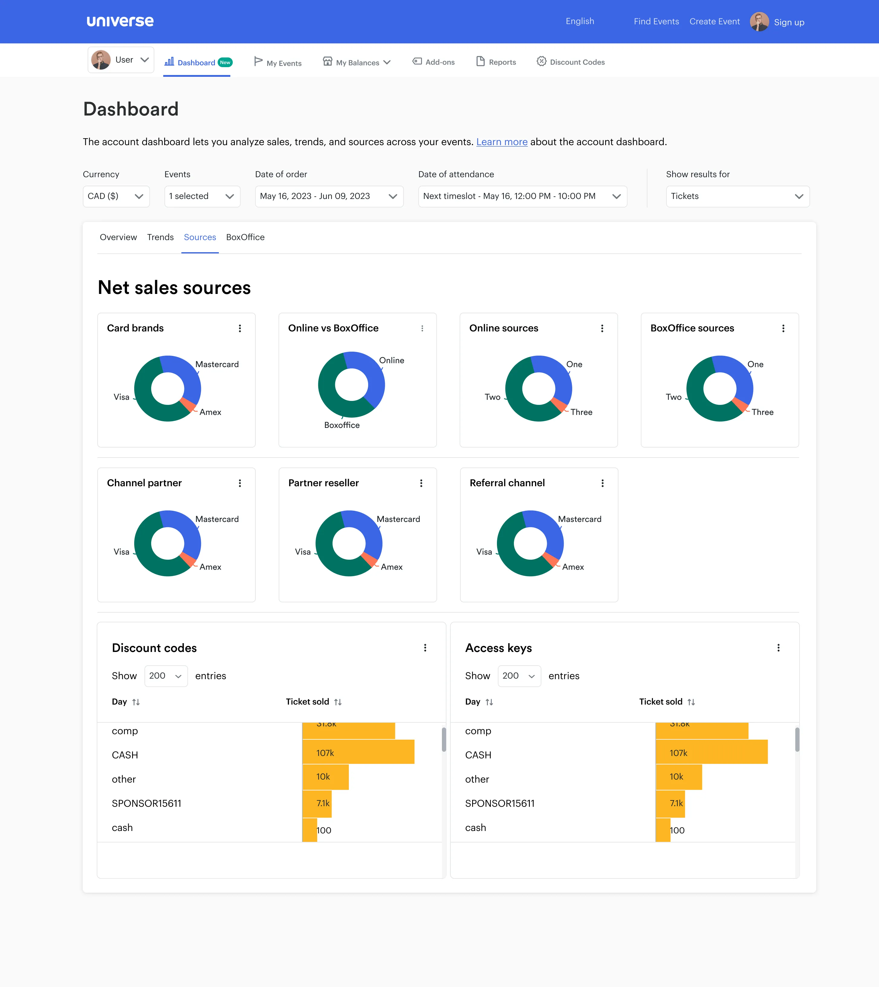
Final Solution
SOME CHANGES
You may have noticed that the dashboards above don't completely match intended designs.
Unfortunately, our developers ran into more restrictions than anticipated styling Superset.
These roadblocks were meant to be resolved but were deprioritized so the project would remain on schedule.
Unfortunately, our developers ran into more restrictions than anticipated styling Superset.
These roadblocks were meant to be resolved but were deprioritized so the project would remain on schedule.
Feedback from clients
With dashboards built and live for our beta clients, it was time to invite them.
They were excited to see Universe had listened and delivered on the aspects they cared about most, while hopeful for future iterations.
Some were not 100% happy with lingering performance issues, and for a few of these, we were still missing the analytics they wanted.
But from a design and usability perspective, we had gotten up to 85% of the way there, according to client surveys.

Was our hypothesis correct in the end?
Yes. We hypothesized that If we provide clients with a unified, visually-rich reporting dashboard that surfaces key metrics, allows flexible filtering, consolidates fragmented views, and enables accurate reconciliations, then adoption would likely increase increase 5% over legacy dashboards. We surpassed that target, getting up to 60% adoption by the end of the year.
What was the final internal feedback?
At first, our internal teams were concerned our solution would be something they would be hard to relearn and teach their clients. As the year went by, we received great feedback that was turned into documentation, training, and small iterations.
MAIN PROBLEM SOLVED
While there were still some things to iron out, we created a product that met our client's highest priority asks. By collaborating with my Design, PM, Engineering, Marketing and Leadership teams, we were able to leverage existing research, plan for future research, gather insights from interviews and usability testing that helped get us there.
Impact

Happy Clients
Test clients were mostly happy with our solution, and looked forward to future iterations.

Adoption
Slowly but surely, all of our clients moved from using legacy dashboards to our redesign.

Support
Our internal teams reported a significant increase in support requests a year after release.
REFLECTION
If there’s one thing I would do differently, it’s being more vocal about using a free, third party, open source piece of software to bring a complex feature to life. Using Superset caused a lot of friction when it came to matching it with Universe design branding, and it proved to be very limiting for our engineering teams as well. Other than that, I am proud of how I tackled this project overall. I exhausted my research tools and leveraged the entire company, so I believe we got as close as possible to our vision for this project.
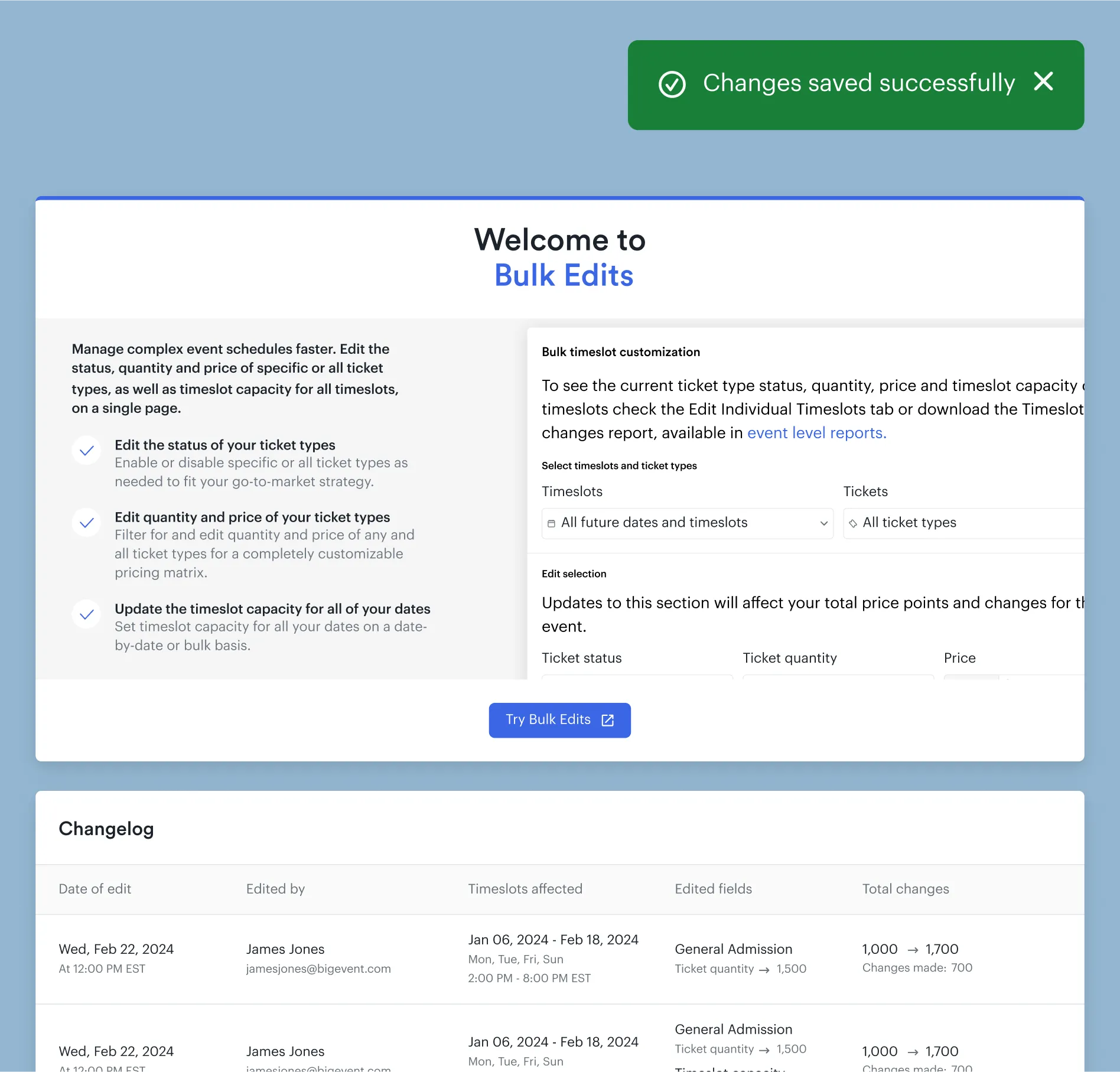
Up next
Bulk edits