From 5 pages to 2: making reports trusted by users while creating a scalable platform.
Universe reports were a mess of legacy flows that confounded clients, causing churn. I was tasked with diagnosing the problem, solving for a broken system, ensuring the solution met business requirements, and providing post-release support.

60% Adoption
Over legacy reports, allowing us to sunset legacy offerings.
80% Task Completion
Users could locate, filter, and export a report without workarounds.
100% Consistency
Users could now trust what they were seeing, and trust retained clients.
40% Customizations
Users proved that the new IA made customizing their data effortless.
Role
Solo Product Designer.
Assisted by 3 others.
10 months.
What I owned
Problem framing, design strategy, constraint management, testing, stakeholder management, post-release.
Team
Product Manager.
3 Frontend Developers.
2 Data Engineers.
Skills
End-to-end product design.
Solving a broken system.
Selling design approach and value.
Solution
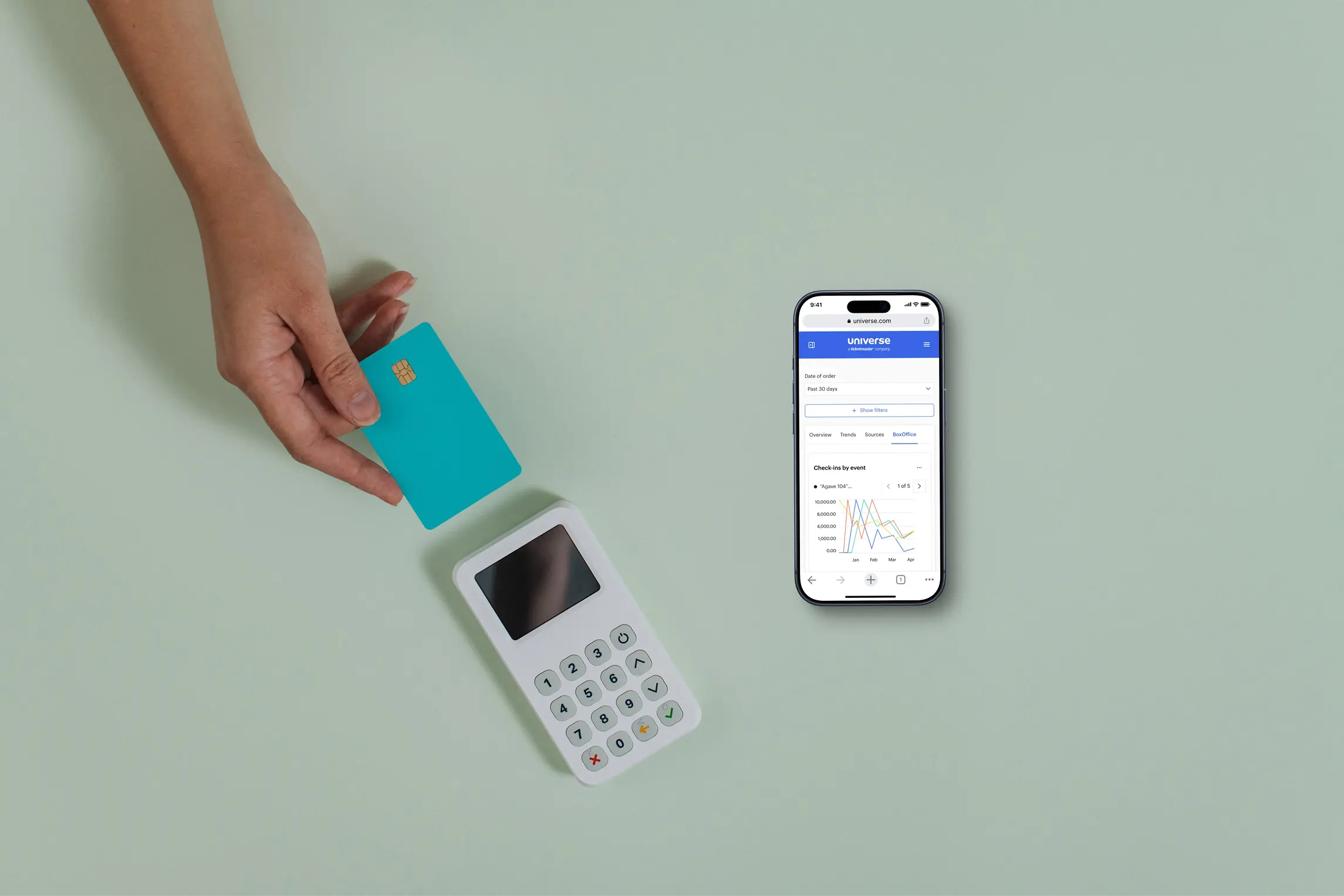
Account dashboards and reports unified in a single experience, solving for cognitive load, recall, and errors.
The design philosophy was simplicity by default, depth when needed. Simplicity came from expanding the Account Dashboard, and depth from Account Reports.

Account Dashboards were the beginning of user flows.
It surfaced actionable data at a glance.

Account Reports let users make complex changes.
By choosing which columns to export, they could compare and constrain their data.
PROBLEM
High-value enterprise clients were leaving Universe because reporting did not meet their business needs.
They didn’t trust the numbers, couldn’t find the answers they needed, and the business attempted band-aid solutions that compounded pain points.
How might we design accurate and scalable reporting to set the business up for success while making Universe the best choice for our clients?
Approach
We would sunset event dashboard and reports, as well as custom reports. Less pages mean less confusion, cognitive load, and error prevention for users.
Challenge
Universe was hesitant to sunset pages they had spent years investing in.
Solution
I collaborated with my PM and dev lead to pitch an iterative path, starting with the release of dashboards.

Stakeholder Management
Our plan was to monitor dashboard performance post-release and meet with senior leadership stakeholders early and consistently, ensuring our solution met business needs at every step.
Designs
Started with a modal approach to minimize complexity, but went full-page for better sacalability.
Modals over-constrained interactions. Full-page designs were modelled after Excel pivot tables for 1:1 export parity, but users found it overwhelming.


Cross-functional collaboration
I worked through solutions with my PM and dev lead. They sat in the interviews I led, worked through iterations with me, worked through challenges and formed our project strategy together.
Designs
Translated wireframes to keep metrics above the fold, filters contextual, and by integrating account reports.
Side navigation was not ideal for mobile breakpoints, and too many navigation options muddled guided sequencing. Optimized for mobile by splitting pages into themes.

Superset allowed us to meet accessibility requirements and leverage simple Dashboard customizations out of the box.
Trade-off
Dashboards came to life quickly by using Apache Superset, but Superset could not fully match our design system. I optimized for functional dashboards over design perfection to get it in front of users.
Challenge
I pushed back on using Superset due to its rigidity and performance issues, predicting it would erode user trust.
Solution
I worked with my dev team to get the most out of Superset, mitigating some of its shortcomings.
We released this functional, albeit imperfect version to get real-world feedback.
I monitored usage and gathered insights to improve reporting over time.
Post Release feedback
53% Testers
Found what they were looking for in Dashboards, relying less on Reports for simple queries.
Demographic Data
A sought after feature we could not include due to technical limitaions, but planned for future iterations.
Performance
Was improved over legacy reporting, but remained inconsistent for a while after release.
+17% Approval Rating From Legacy
People preferred our dashboard solution, with plenty of room for improvement.
Outcome
Solving design principle errors helped achieve business outcomes, maintaining revenue through user retention.
Though I would not see the full release of our proposed reporting solution, I left Universe with everything they needed to continue testing and iterating.

Reflection
I learned that execution matters as much as vision, how to align stakeholders to design vision, and how to maintain that alignment through the entire product lifecycle.

Next up
